The Project
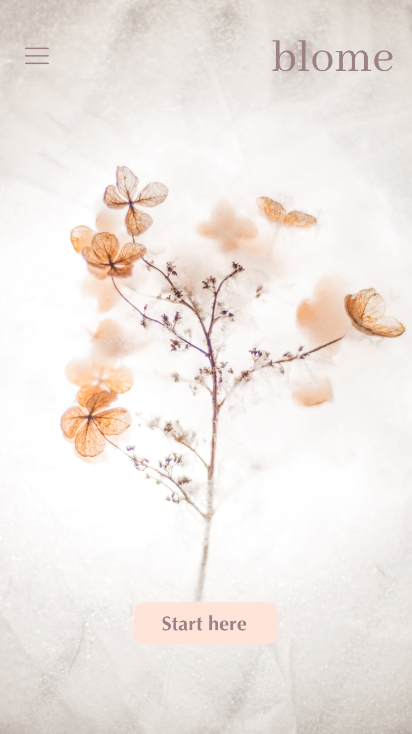
Blome is a flower delivery app that offers a large selection of flowers, including letterbox flowers, and a simple ordering process.
This project was part of my Google UX Design Professional Certificate.
I was the sole designer and my work included research, ideation, design, and usability testing.
Duration: August - September 2021.

The Problem &
Solution
Busy users are looking for a flower delivery app that offers a quick & simple ordering process and the same variety of flowers as in a brick & mortar flower shop.
The Blome app offers users a reliable and quick service and a wide variety of flowers.


The Process
Research: User interviews
Empathise: User persona & user journey map
Ideate: Competitive analysis, paper & digital wireframes
Design: Mockups & prototype
Test: Usability testing
Iterate: Based on insights from usability testing
Research
The project kicked off with a series of interviews that helped us understand the user's needs. The interviews were conducted in person as well as via video calls. Once they were finalized, we created transcripts, and based on the information gathered we were able to identify pain points, create user personas & the user journey map.


Ideate & Test
Once the user persona and user journey were defined, we started drafting the wireframes, first on paper to allow for quick changes, and then the digital wireframes in Figma. We were then able to move to the next phase of the project: usability testing.
The goal of the usability test was to determine if users could complete core tasks within the app and whether the app was difficult to use. The test was conducted remotely and the participants were busy people, many of them traveling extensively, three male and two female between the ages of 20 and 50.
Usability test findings:
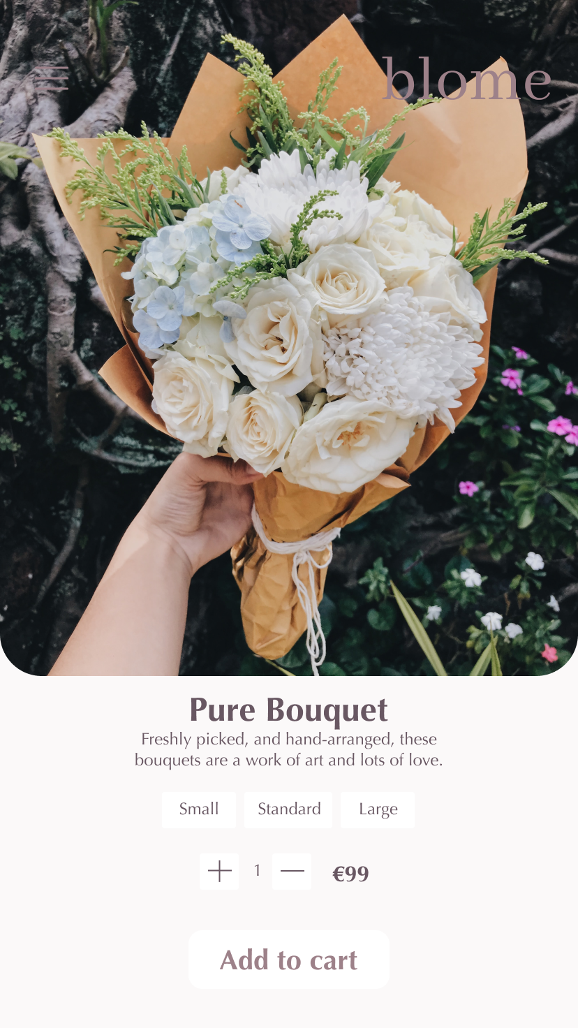
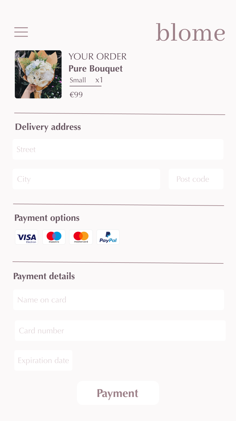
Simple ordering process: users want to order flowers quickly and easily, ideally in a few clicks.
Full description of flowers: users want a description of the flowers including size and colors.
Clear action buttons: users need clearly highlighted action buttons.
Consistency: users want consistency, especially for features such as the back arrows..


Design & Refine
Following the usability test findings, we started working on the app mockups. The inspiration for the visual design elements was English gardens and the color palette was chosen so that it would highlight the flower offering as well as provide enough contrast for accessibility purposes.
Other accessibility considerations were :
Providing access to users with vision impairment through adding alt text to images for screen readers.
Using detailed images and descriptions for size & colors to help all users understand the designs.
Using icons to help make navigation easier.


Photography by @UnsplashConclusions & Reflections
The Blome app was the first UX/UI Design project I worked on and it allowed me to apply the design process from end to end.
From research to drawing paper & digital wireframes to creating mockups and conducting usability studies, this first experience was invaluable, especially in understanding and applying a human-centered design process.